Donewaiting’s first foray into this “Behind the Artwork” feature was with Mike Carney, who did the cover of Heartless Bastards’ The Mountain and the entire Black Keys discography. This time around, we decided to get the skinny on Times New Viking‘s new one from TNV drummer/vocalist Adam Elliott. (Can you tell yet that we’re excited about this record?)
Elliott answered the questions I sent him with his usual candor, and it’s a pretty good insight not only into the reasons behind the album covers these art-school kids create, but also the creative philosophy behind the band itself.
Who does the band’s cover art, or is it a collaboration?
all of our art is a collaboration, much like all of our music. when we were in actual art school we started the band with the idea of 300% creative control, which allows every band member to have 100%. someone will come up with an idea, another person will add or subtract and so on until we all get stoned, listen to the record and agree the two go together.
What kind of process do you use to create the finished product?
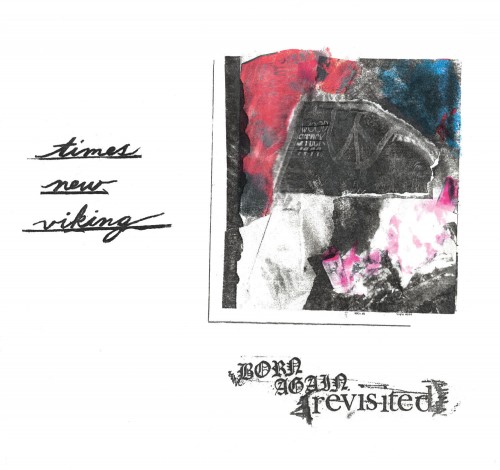
we don’t use any computers during recording, so we try not use computers with our art as well. we usually send our label the actual final product–the exact 12 inch size. on this record we decided to get away from just plain photocopy and collage and used a technique we finessed at school, an old school photoshop sort of deal. the front cover was done with xylene transfers, even the color, on matte paper, from photocopies. it gives it a soft edge. we also make sure the paper it is printing on is matte, not glossy.
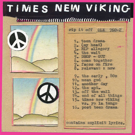
There were peace signs on Rip it Off, and there’s a Woodstock flag with a peace sign on the new album’s cover. What’s the significance of that and other iconography of the ’60s and ’70s (Dylan, rainbows)? And are you visually communicating a similar idea for each album?
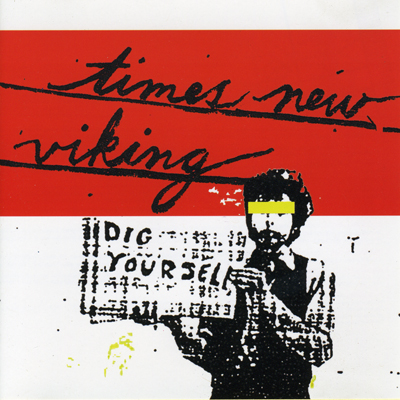
the woodstock flag is from woodstock 99 and sort of symbolizes the differences our generation has from the 60’s, and how their ideals didn’t really work out and became highly glamorized in all the wrong ways. our last record had rainbows and peace signs, this time we have peace signs in flames. and we just love dylan, the back cover is the image we used for dig yourself obviously.
There’s an aesthetic consistency to TNV’s album covers, much like the band’s sound. How do the two fit together?
the consistency is what we are going for. our sound, our songs, our lyrics and our album art are all considered integral in what we represent. i think this allows us to have more depth as a band and concept if the listener takes to the time to make the connections.
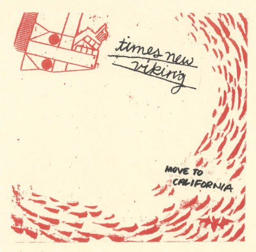
The art for the new 7″ (“Move to California”), though, seems like a bit of a departure from past releases. What direction did you want to take for this one?
actually the image on the front is something we have used from day one. it is the horse from the book version of equus and we kind of adopted it. all our early shirts have that image. the cover was actually what dig yourself was going to be originally. when you get the whole package you will see the connections it has with born again revisited, same label and everything.
Do you do anything different for vinyl releases than CDs, or is the CD just a smaller version?
we think about the cd version absolutely last. i hate cd packaging. on this record, we made sure we had the insert be the record sleeve so there isn’t anything floating around. we try to make it that if you only have our sleeve, or only just the record down the line, you will know the song titles, year it was made and so on. we try to keep info to a low. for the cd we had to rearrange it to make it work, but it loses the purpose but who buys fucking cds anyway?
What are some album covers that have inspired your work?
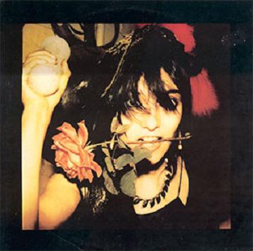
for this record we were inspired by private press christian records. the front cover is based around that. as far as covers we really enjoy primitive, homemade stuff. DIY seven inches and so on. my favorite cover of all time would probably be flowers of romance by PIL though.
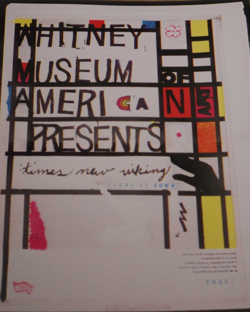
You also made a poster for the Whitney Museum of American Art show last year. What other visual mediums do you dabble in?
beth designed that. we played at the whitney in front of a robert rauschenberg, how insane is that. for art school kids just playing loud music, that was an experience i will never forget. it is a funny design too since she used a mondrian print and he is definitely not american.
to answer your question, beth has been working on films. she showed one this year at the wexner, bang wash productions i believe. you tube it dude.
i make collages and conceptual tattoos.
jared dabbles mostly in the art of conversation and drinking with friends though he is an amazing drunk illustrator and i try to get him to paint.
we are all very well versed in art history.
Can you show us your work area?
it is just the floor. in art school my teacher told me once i made art that looks like it was made on my kitchen table. he was trying to be condescending, but i actually did make it on my kitchen table.
——————
mp3: Times New Viking – Move to California
mp3: Times New Viking – No Time No Hope
Born Again Revisited is out Tuesday on Matador.

the “columbus look”.
its official the phrase has been coined.
m.
Pingback: Behind the Artwork « Gotta Groove Records