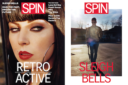
After spending some time with the newly redesigned and refocused SPIN –– the March/April edition with Sleigh Bells on the cover — I’m convinced it’s the first music magazine to finally get ahead of the curve, and it did so by embracing some things that would seem counterintuitive at first glance.
It’s large. While every magazine and newspaper in America is getting smaller and thinner, SPIN just got bigger and thicker — 9.5 inches wide and a foot long. (Most glossies, in comparison, are around 8 inches wide and between 10 and 11 inches in length.) That means big art, more art and more text. It also means that the magazine is now bimonthly, likely because even a mainstream pub like SPIN can’t afford to put out a magazine like that every month. But in adjusting to bimonthly, SPIN forced itself to become what a post-Web 2.0 music magazine should be: A place for long-form stories and analysis (with nice, wide columns of text). Even daily print publications rarely break news that wasn’t first found on the web, so a monthly or bimonthly magazine shouldn’t attempt to. The stories should hold up. They should be relevant two months after the magazine hits newsstands. Judging by this first issue, SPIN gets that.
It feels good. It’s bulky and remains perfect-bound, but the gloss is gone. The matte cover is a thick card stock, and more than half the magazine is matte. It feels special, artful, homemade and more than a bit nostalgic, but not cloying Instagram-nostalgic. (There’s still some glossy pages in the first half of the book; I’d recommend going all in and getting rid of the glossy feel entirely.)
Continue reading


